Using metafoR and ggplot together:part 2

In the last post I introduced you to the basics of meta-analysis using metafor together with ggplot2. If you haven’t seen that post, I suggest you go back and read it since this post will be hard to follow otherwise.

In this post I will concentrate on trying to explain differences between different sites/studies.

Going back to our previous example, we saw that logging tended to have a negative effect on species richness.

Luckily my completely made up data had information on the intensity of logging (volume of wood removed per hectare) and the method used (conventional or reduced impact).

We can make a model looking at the effects of logging intensity and method on species richness. First we can start with our most complex model

Model1<-rma.uni(yi,vi,mods=~Intensity*Method,method="ML",data=ROM)
summary(Model1)

This spits out the following:

Mixed-Effects Model (k = 30; tau^2 estimator: ML)

  logLik  deviance       AIC       BIC
-15.8430  121.7556   41.6860   48.6920

tau^2 (estimated amount of residual heterogeneity):     0.1576 (SE = 0.0436)
tau (square root of estimated tau^2 value):             0.3970
I^2 (residual heterogeneity / unaccounted variability): 96.52%
H^2 (unaccounted variability / sampling variability):   28.74

Test for Residual Heterogeneity:
QE(df = 26) = 1151.1656, p-val &amp;lt; .0001

Test of Moderators (coefficient(s) 2,3,4):
QM(df = 3) = 38.2110, p-val &amp;lt; .0001

Model Results:

                     estimate      se     zval    pval    ci.lb    ci.ub
intrcpt                0.1430  0.3566   0.4011  0.6883  -0.5558   0.8419
Intensity             -0.0281  0.0099  -2.8549  0.0043  -0.0474  -0.0088  **
MethodRIL              0.1715  0.4210   0.4074  0.6837  -0.6536   0.9966
Intensity:MethodRIL    0.0106  0.0138   0.7638  0.4450  -0.0166   0.0377

---
Signif. codes:  0 ‘***’ 0.001 ‘**’ 0.01 ‘*’ 0.05 ‘.’ 0.1 ‘ ’ 1

Looking at our residual plots, they seem to conform to our assumptions of constant variance.

plot(fitted.rma(Model1),residuals.rma(Model1))
qqnorm.rma.uni(Model1)

Our models suggests that the more wood is extracted from a forest the greater the negative effect on species richness, but that seems to be little evidence about the effect of method or the the interaction between intensity and method.

So, lets get rid of the interaction and see what happens:

Model2<-rma.uni(yi,vi,mods=~Intensity+Method,method="ML",data=ROM)
summary(Model2)


Mixed-Effects Model (k = 30; tau^2 estimator: ML)

  logLik  deviance       AIC       BIC
-16.1323  122.3341   40.2646   45.8694

tau^2 (estimated amount of residual heterogeneity):     0.1606 (SE = 0.0443)
tau (square root of estimated tau^2 value):             0.4008
I^2 (residual heterogeneity / unaccounted variability): 96.75%
H^2 (unaccounted variability / sampling variability):   30.80

Test for Residual Heterogeneity:
QE(df = 27) = 1151.4310, p-val &amp;lt; .0001

Test of Moderators (coefficient(s) 2,3):
QM(df = 2) = 36.9762, p-val &amp;lt; .0001

Model Results:

           estimate      se     zval    pval    ci.lb    ci.ub
intrcpt     -0.0416  0.2648  -0.1570  0.8753  -0.5606   0.4774
Intensity   -0.0228  0.0070  -3.2617  0.0011  -0.0364  -0.0091  **
MethodRIL    0.4630  0.1803   2.5681  0.0102   0.1096   0.8163   *

---
Signif. codes:  0 ‘***’ 0.001 ‘**’ 0.01 ‘*’ 0.05 ‘.’ 0.1 ‘ ’ 1

Now both intensity and method are statistically significant, but method less so. Let’s take it out:

Model3<-rma.uni(yi,vi,mods=~Intensity,method="ML",data=ROM)
summary(Model3)


Mixed-Effects Model (k = 30; tau^2 estimator: ML)

  logLik  deviance       AIC       BIC
-19.1526  128.3747   44.3052   48.5088

tau^2 (estimated amount of residual heterogeneity):     0.1962 (SE = 0.0536)
tau (square root of estimated tau^2 value):             0.4429
I^2 (residual heterogeneity / unaccounted variability): 97.45%
H^2 (unaccounted variability / sampling variability):   39.27

Test for Residual Heterogeneity:
QE(df = 28) = 1258.6907, p-val &amp;lt; .0001

Test of Moderators (coefficient(s) 2):
QM(df = 1) = 25.2163, p-val &amp;lt; .0001

Model Results:

           estimate      se     zval    pval    ci.lb    ci.ub
intrcpt      0.4678  0.1927   2.4276  0.0152   0.0901   0.8455    *
Intensity   -0.0324  0.0065  -5.0216  &amp;lt;.0001  -0.0451  -0.0198  ***

---
Signif. codes:  0 ‘***’ 0.001 ‘**’ 0.01 ‘*’ 0.05 ‘.’ 0.1 ‘ ’ 1

Unsurprisingly, intensity is now more significant. However, we have taken out method which may have some value in explaining differences. The tool I use most for model selection is AIC. This basically aims to get the best fitting model with the least explanatory variables. This is why I did the last step of removing method. It could be that the effect of method is significant but adds relatively little explanatory power to our model.

Let’s test this by calculating their AICs.

AIC(Model1)
AIC(Model2)
AIC(Model3)


[1] 41.68604
> AIC(Model2)
[1] 40.26459
> AIC(Model3)
[1] 44.30516

We choose the model with the lowest AIC, in this case Model2.

To calculate the fit of our model, we can compare it to our intercept only model (the original meta-analysis from part 1), but we have to set method=”ML” since REML is a poor estimator of deviance.

ROM.ma2&amp;lt;-rma.uni(yi,vi,method=&amp;quot;ML&amp;quot;,data=ROM)
summary(Model2)
summary(ROM.ma2)

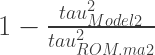
Using the two Tau squared statistics we can calculate the proportion of deviance not explained by the intercept only model using the sum:
1-\frac{tau^{2}_{Model2}} {tau^{2}_{ROM.ma2}}

in.plot<-ggplot(data=ROM,aes(x=Intensity,y=yi,size=1/vi,colour=Method))+geom_point(data=ROM,shape=16)
in.plot2<-in.plot+geom_line(data=ROM,aes(x=Intensity,y=preds,size=1))
in.plot3<-in.plot2+ylab("log response ratio")+xlab("Logging intensity (m-3 ha-1)")
in.plot3+theme(legend.position="none")

Very pretty.
Intens_RR

Circle size is relative to weight for each study, since we weight the most precise studies most heavily. Blue points and line refer to reduced impact logging sites, while red refers to conventionally logged sites.

We can also transform it all to proportions for more intuitive interpretations:

theme_set(theme_bw(base_size=10))
in.plot<-ggplot(data=ROM,aes(x=Intensity,y=exp(yi)-1,size=1/vi,colour=Method))+geom_point(data=ROM,shape=16)
in.plot2<-in.plot+geom_line(data=ROM,aes(x=Intensity,y=exp(preds)-1),size=1)
in.plot3<-in.plot2+ylab("Proportional change\nin species richness")+xlab("Logging intensity (m-3 ha-1)")
in.plot3+theme(legend.position="none")

Intens_Prop
The graphs show that, for my made up data, reduced impact logging has a less negative effect than conventional logging on species richness when carried out at similar intensities but that increasing intensity leads to reductions in species richness for both conventional and reduced impact methods.

I think that wraps it up for now. I hope you’ve found this useful. As ever any comments or questions are welcome.
I will be back to writing non-stats posts again soon!

Using metafoR and ggplot together:part 1

I really like meta-analysis, as some of you might already  know.

It has it’s critics but used well it can help us achieve one of the major goals of applied ecology: generalisation. This way we can say how we think things generally work and draw conclusions bigger than  individual studies.

However, for some reason people have got it into their head  that meta-analysis is hard. It’s not. The hardest thing is the same as always, coming up with a good question/problem.

However, for a first timer it can seem daunting. Luckily there are a few good R packages for doing meta-analysis, my favourite of which is metafor.

The aim of these posts is to take some of the mystery out of how to do this and was prompted by a comment from Jarret Byrnes on a previous blog post.

In the first post I will deal with effect sizes, basic meta-analysis, how to draw a few plots and some analyses to explore bias. In the second I will go through meta-regression/sub-group analysis and a few more plots. It shouldn’t be too hard to understand.

For this I will use a dataset based on some work I am doing at the moment looking at the effects of logging on forest species richness. However, I don’t really feel like sharing unpublished data on the web so I’ve made some up based on my hypotheses prior to doing the work.

First of all we need to install the right packages and open them

install.packages("metafor")
install.packages("ggplot2")

library(metafor)
library(ggplot2)

Next we need the data, download it from here and get r to load it up:

logging<-read.csv("C:whereveryouputthefile/logging.csv")

This file contains data on species richness of unlogged (G1) and logged (G2) forests, it’s not perfect as all of the data is made up – it should be useful for an exercise though.

First we need to calculate the effect size. This is essentially a measure of the difference between a treatment and control group, in our case logged (treatment) and unlogged (control) forests. We can do this in different ways, the most commonly used in ecology are the standardised mean difference (SMD) and log mean ratios (lnRR).

The SMD is calculated like this:

\frac{\bar{X_{1}}-\bar{X_{2}}} {SD_{pooled}}

where \bar{X_{1}}and \bar{X_{2}} are the different group means, SD_{pooled} is the pooled standard deviation ( I won’t explain this here but there are good explanations elsewhere). Essentially what this does is to give an effect size based on the difference between groups with more imprecise studies having a smaller effect size.

The lnRR is calculated as:

ln{\bar{X_{1}}-ln\bar{X_{2}}}

which gives the log of the proportional difference between the groups. I quite like this as it is easier to interpret than the SMD as the units can be back-transformed to percentages.

In metafor you calculate SMD by doing this:

SMD<-escalc(data=logging,measure="SMD",m2i=G1,sd2i=G1SD,n2i=G1SS,m1i=G2,sd1i=G2SD,n1i=G2SS,append=T)

and lnRR like this:

ROM<-escalc(data=logging,measure="ROM",m2i=G1,sd2i=G1SD,n2i=G1SS,m1i=G2,sd1i=G2SD,n1i=G2SS,append=T)

From now on in this post I will use the lnRR effect size.

Next we carry out a meta-analysis using the variability and effects sizes of each set of comparisons to calculate an overall mean effect size, using the idea that we want to give most weight to the most precise studies.

In metafor you do that by doing this:

SMD.ma<-rma.uni(yi,vi,method="REML",data=ROM)
summary(SMD.ma)

This is the code for a mixed effects meta-analysis, which basically assumes there are real differences between study effect sizes and then calculates a mean effect size. This seems sensible in ecology where everything is variable, even in field sites which quite close to each other.

The code it spits out can be a bit daunting. it looks like this:

Random-Effects Model (k = 30; tau^2 estimator: REML)

  logLik  deviance       AIC       BIC
-27.8498   55.6997   59.6997   62.4343

tau^2 (estimated amount of total heterogeneity): 0.3859 (SE = 0.1044)
tau (square root of estimated tau^2 value):      0.6212
I^2 (total heterogeneity / total variability):   98.79%
H^2 (total variability / sampling variability):  82.36

Test for Heterogeneity:
Q(df = 29) = 2283.8442, p-val < .0001

Model Results:

estimate       se     zval     pval    ci.lb    ci.ub
 -0.4071   0.1151  -3.5363   0.0004  -0.6327  -0.1815      ***

Essentially what it’s saying is that logged forests tend to have lower species richness than unlogged forests (the model results bit), and that there is quite a lot of heterogeneity between studies (the test for heterogeneity bit).

We can calculate the percentage difference between groups by doing taking the estimate part of the model results along with the se and doing this:

(exp(-0.4071)-1)*100
(exp(0.1151*1.96)-1)*100

to get things in percentages. So, now we can say that logged forests have 33% less species than unlogged forests  +/- a confidence interval of 25%.

We can summarise this result using a forrest plot in metafor, but this is a bit ugly.

forest.rma(SMD.ma)

Forest_plot

What did I tell you? Pretty ugly right?

Much better to use ggplot2 to do this properly. But this is a bit of a pain in the arse:

theme_set(theme_bw(base_size=10))
forrest_data<-rbind(data.frame(ES=ROM.ma$yi,SE=sqrt(ROM.ma$vi),Type="Study",Study=logging$Study),data.frame(ES=ROM.ma$b,SE=ROM.ma$se,Type="Summary",Study="Summary"))
forrest_data$Study2<-factor(forrest_data$Study, levels=rev(levels(forrest_data$Study)) )
levels(forrest_data$Study2)
plot1<-ggplot(data=forrest_data,aes(x=Study2,y=ES,ymax=ES+(1.96*SE),ymin=ES-(1.96*SE),size=factor(Type),colour=factor(Type)))+geom_pointrange()
plot2<-plot1+coord_flip()+geom_hline(aes(x=0), lty=2,size=1)+scale_size_manual(values=c(0.5,1))
plot3<-plot2+xlab("Study")+ylab("log response ratio")+scale_colour_manual(values=c("grey","black"))
plot3+theme(legend.position="none")

better_forrest

There. Much better.

With a little tweak we can even have it displayed as percentage change, though your confidence intervals will not be symmetrical any more.

theme_set(theme_bw(base_size=10))
plot1<-ggplot(data=forrest_data,aes(x=Study2,y=(exp(ES)-1)*100,ymax=(exp(ES+(1.96*SE))-1)*100,ymin=(exp(ES-(1.96*SE))-1)*100,size=factor(Type),colour=factor(Type)))+geom_pointrange()
plot2<-plot1+coord_flip()+geom_hline(aes(x=0), lty=2,size=1)+scale_size_manual(values=c(0.5,1))
plot3<-plot2+xlab("Study")+ylab("Percentage change in richness\n as a result of logging")+scale_colour_manual(values=c("grey","black"))
plot3+theme(legend.position="none")+ scale_y_continuous(breaks=c(-50,0,50,100,150,200))

better_forrest_percentage

There that’s a bit more intuitively understandable, isn’t it?

Right, I will sort out the next post on meta-regression and sub-group analysis soon.

In the meantime feel free to make any comments you like.